DOWNLOAD The Auction Profit Blueprint
The 4 tools BIG organizations use every time to skyrocket auction profits!
The Step-By-Step Guide to stop leaving thousands on the table.
Explore examples of donation pages. CharityAuctionsToday offers samples of successful donation page designs that can help you raise more with yours.

In the digital age, a well-designed donation page is crucial for nonprofits. It serves as a key touchpoint for potential donors.
But what makes a donation page effective?
It’s not just about aesthetics. User experience plays a significant role.
A seamless, intuitive donation process can boost conversion rates. It can turn website visitors into committed donors.
Storytelling is another vital element. It helps engage potential donors on an emotional level.
By sharing compelling narratives about your cause, you can inspire more people to contribute. Simplifying the donation process is equally important.
Donors appreciate a straightforward, hassle-free experience. The fewer obstacles they encounter, the more likely they are to complete their donation.
This article will delve into these aspects and more. We’ll explore key elements that make a donation page effective.
We’ll also highlight inspiring donation page examples from small nonprofits. These examples will serve as a guide for those looking to enhance their online fundraising efforts, even if they have fewer resources than nationwide organizations.
Whether you’re a nonprofit organization, a digital marketer, a web designer, or a fundraiser, this article is for you.
Get ready to gain actionable insights on improving your donation page user experience. Let’s dive into the world of effective online fundraising.
Welcome to our comprehensive guide on inspiring donation page examples for nonprofits.
A well-designed donation page is the cornerstone of successful online fundraising. It is where prospective donors decide to support your cause. Therefore, clarity and engagement must be prioritized.
An effective donation page builds trust with potential donors. First impressions matter significantly. If donors feel confident, they’re more likely to contribute. This trustworthiness can be visually represented by clean design and reliable functionality.
Moreover, the design must accommodate various devices. Mobile responsiveness ensures that anyone can donate seamlessly. Many users access websites via smartphones or tablets, so your page must function flawlessly across platforms.
In addition, a well-structured donation page communicates your organization’s mission clearly. Proper storytelling fosters an emotional connection, making donors feel personally connected to your cause. This element is crucial for encouraging generous donations.
To sum up, consider these key aspects:
Ultimately, focusing on these aspects will create a strong foundation for your donation page. By investing time in thoughtful design, nonprofits can see improved engagement and donation rates. With these best practices, your organization can inspire and motivate donors to support your vital work.
Creating an effective donation page involves understanding several core elements. These elements are critical for converting interested visitors into active donors. A well-optimized page makes all the difference.
Clarity is essential. Visitors must immediately understand your mission and goals. Brief, concise content helps convey this. Avoid overwhelming potential donors with lengthy explanations.
Next, compelling visuals play a key role. Images and videos can highlight the impact of donations. They enhance emotional connections, encouraging people to contribute.
Moreover, calls-to-action (CTAs) must stand out. An impactful CTA guides donors towards making a decision. Effective CTAs are clear and action-oriented.
Trust signals are equally important for donor reassurance. Security badges, transparency statements, and testimonials build credibility. People prefer donating where they feel safe and informed.
Lastly, consider the following checklist for your donation page:
By incorporating these elements, you set the stage for a successful donation page. The aim is to reduce barriers and inspire confidence in your potential donors, resulting in higher conversion rates.
User experience (UX) on a donation page significantly impacts conversion rates. A seamless experience can be the deciding factor for donors. Therefore, UX needs careful consideration.
Begin with navigation. Visitors should easily find information and understand how to donate. Any confusion can lead to lost donations, which is why clarity in design is crucial.
Responsive design comes next. As more donors use mobile devices, your page should adapt to various screen sizes. Inflexible design may deter mobile users, causing a drop in donations.
Speed also plays a role. Long loading times frustrate users and drive them away. A fast, efficient donation process keeps donors engaged until completion.
Finally, reduce friction in the donation process. Simplify form fields and instructions. The easier it is for donors to contribute, the higher your conversion rates will be.
In sum, focus on UX to boost donation success. A well-designed user experience makes the donation process inviting and straightforward. This way, more supporters will complete their donations.
Storytelling is a powerful tool in engaging donors on donation pages. It’s not just about funds. It’s about motivating individuals to become part of your narrative.
Craft a compelling story that highlights real impacts. Share stories of beneficiaries or community changes. These narratives make the cause relatable and urgent for potential donors.
Incorporate emotion to resonate more deeply. Donors need to feel their contributions make a tangible difference. Emotional appeals can transform passive visitors into active supporters.
Support stories with visuals. Photos and videos can illustrate your narrative effectively. They provide a window into your organization’s achievements and goals.
Personalize the experience with storytelling. Address potential donors directly, creating a connection. This personalization increases the likelihood of donations by making the donors feel seen and valued.
By focusing on storytelling, you build a lasting relationship with supporters. This connection often translates into continued support and advocacy.

by Hal Gatewood, Unsplash
An effective donation page simplifies the entire donation process. Complexity can deter potential donors. Your aim should be a straightforward, hassle-free experience.
Start by minimizing form fields. Only request essential information from donors. Reducing unnecessary steps helps donors complete their transactions quickly.
Offer multiple payment options. Different donors prefer different payment methods. Providing variety caters to their preferences, encouraging contributions.
Embed clear instructions for each step. Ambiguity may cause hesitation. Simple, direct guidance ensures donors understand how to proceed without confusion.
Make the process mobile-friendly. Many donors wish to contribute on-the-go. Ensuring functionality on smartphones and tablets is crucial for maximizing donations.
Lastly, maintain a seamless transition from the call-to-action to payment. An intuitive flow is necessary for retaining donors’ focus and facilitating donations.
By simplifying the process, you enhance user satisfaction and likely increase donation numbers. Supporting a cause should be easy and rewarding for all involved.
In the digital age, mobile responsiveness is imperative for donation pages. Many donors access websites via mobile devices. If your page isn’t mobile-friendly, you risk losing these potential contributions.
Responsive design ensures that your donation page works seamlessly across all devices. This includes smartphones, tablets, and desktops. A consistent user experience is crucial for maintaining donor engagement.
Performance is equally important. A slow-loading page can frustrate users, leading to abandonment. Quick load times keep potential donors engaged. Optimize your site to reduce load times and improve performance.
Additionally, ensure that all elements are easily accessible on smaller screens. This includes form fields, buttons, and CTAs. By prioritizing mobile responsiveness and performance, you enhance accessibility, improving donation conversion rates. These adjustments ensure that no potential donation opportunity is missed.
A compelling call-to-action (CTA) is pivotal on any donation page. It directs the donor’s journey and motivates action. Without a clear CTA, potential donors might hesitate or leave the page.
Your CTA should be clear, concise, and prominent. Use action-oriented language that encourages immediate responses. Phrases like “Donate Now” or “Join Us” are effective in creating a sense of urgency.
Placement of the CTA is also crucial. It should be easily visible, ideally above the fold. Consider using contrasting colors to make it stand out against your page’s background.
Furthermore, personalize your CTAs to connect emotionally. A personalized message can make donors feel special, increasing their likelihood to contribute. By crafting engaging CTAs, you can significantly impact donation conversion rates.
Establishing trust is crucial for any nonprofit’s donation page. Donors need assurance that their contributions are safe. Trust signals are key to building this assurance.
Security badges play a significant role. Displaying symbols of secure payment methods like SSL encryption reassures donors. These symbols signal that their financial information will be protected.
Transparency also builds trust. Clearly describe how donations will be used. When donors understand the impact of their contributions, they feel more connected to the cause.
Finally, include testimonials and endorsements. Positive feedback from past donors can be persuasive. It shows potential donors that others believe in your mission. Together, these elements foster a trustworthy environment that encourages donations.
Social proof is a powerful tool for encouraging donations on a nonprofit’s page. It works by demonstrating that others support the cause, prompting new donors to follow suit.
Displaying recent donor names or amounts creates a sense of community. It shows that people are actively contributing and supporting the mission. This can motivate visitors to join in and make their own contribution.
Highlighting statistics can also be effective. Share the number of donations or funds raised during a campaign. This information offers validation and can create urgency or a sense of competition among donors.
Moreover, using stories from beneficiaries acts as compelling social proof. Real-life success stories illustrate the tangible impact of donations. When donors see how contributions change lives, they are more likely to give willingly. By weaving social proof into the donation page, nonprofits can significantly enhance donor engagement and support.
Providing multiple payment options is crucial for any donation page. By offering different methods, you cater to a wide array of donors. People have varied preferences, so flexibility is key to meeting their needs.
Credit cards, PayPal, and digital wallets are common choices. Including these options allows donors to use the method they feel most comfortable with. This approach can reduce friction and hesitation at the checkout phase.
Streamlining form fields is equally important. Shorter forms reduce the effort required to donate, enhancing the user experience. Keep essential fields only, like name, email, and payment details, to ensure the process is quick and painless.
Each unnecessary field adds an extra step and potential frustration. Aim for clarity and efficiency to increase conversions. A minimalist approach can be the difference between a completed donation and an abandoned one.
Post-donation engagement is vital for fostering long-term donor relationships. It begins right after the donor completes their contribution. A thoughtful thank-you message can make a big impact.
Personalized thank-you emails are effective. They should acknowledge the donor’s unique support and share how their donation will be used. This can create a sense of connection and fulfillment.
Regular updates are also important. Keep donors informed about the progress of your projects. Sharing success stories and tangible outcomes reinforces their decision to support your cause.
Consider inviting donors to join exclusive groups or newsletters. This offers them an insider view, enhancing their involvement. Continued engagement can lead to increased loyalty and recurring donations.
Visual content plays a crucial role in donation pages. Compelling images and videos draw attention and evoke emotions. These elements can vividly communicate your organization’s mission and needs.
Incorporating media elements effectively boosts engagement. A video can share a powerful story in a short time. It allows potential donors to see the real-world impact of their contributions.
Additionally, optimizing your donation page for search engines is essential for visibility. Use targeted keywords like “donation page examples” to reach interested donors. This can help drive organic traffic to your page.
Finally, balance visuals with text to maintain page load speed. Fast-loading pages enhance user experience, helping to keep visitors on the page. This combination of visuals and SEO can lead to a more effective donation page.
Monitoring donation page performance is vital for continuous improvement. Metrics like conversion rates and average donation size provide valuable insights. They help identify areas where the page could perform better.
A/B testing is a powerful tool for refining donation pages. By testing different versions of a page, you can learn what resonates with donors. Test elements like headlines, images, and calls-to-action to see their impact.
When conducting A/B tests, focus on one element at a time. This ensures accurate results and clear insights. Gradual refinements can lead to significant improvements in donor engagement.
Additionally, use data to guide decisions and iterations. Regularly reviewing metrics helps track progress and identify trends. This data-driven approach can create a more effective and efficient donation page.
Examining real-world fundraiser campaign example websites can provide valuable insights into effective donation pages. These examples demonstrate various successful strategies. They highlight best practices that can inspire your nonprofit’s approach.
Each example showcases a unique aspect of effective donation page design. From storytelling to layout, they offer lessons in engaging potential donors. Exploring these examples can spark ideas for your own page.
By analyzing different elements, you can tailor strategies to fit your mission. Consider which features best align with your organization’s goals. Drawing inspiration from successful pages can enhance donor experience and boost conversions.
These examples demonstrate the importance of understanding your audience. Tailoring your message to their motivations is crucial. Crafting a narrative that resonates can make a significant impact.
Additionally, these examples illustrate the power of visuals. Images and videos play a vital role in capturing attention. They can convey your mission’s urgency and create an emotional connection.
Finally, pay attention to user experience. Easy navigation, clear calls-to-action, and quick loading times are essential. These elements are critical in ensuring a seamless donation process.
Even though these organizations are on the smaller side, they have donation pages that pull their weight.
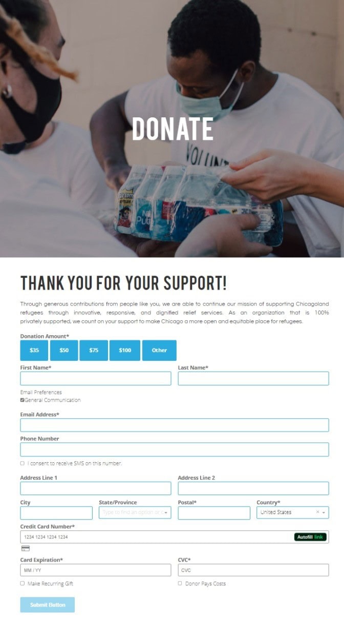
The Chicago Refugee Coalition makes their donation page simple and compelling. The header image shows the real people who might be behind the organization and who they help. Above the form, the subheader thanks the donor before they’ve even committed.
The donation page copy just above the form itself reminds the donor that this organization is 100% privately funded. This helps remind donors of their deep impact when they support refugees in Chicago through this organization.
The form itself is brief and makes choosing a donation amount simple. It also included options to make their donation a recurring one, and to cover donation fees.

Chicago Refugee Coalition donation page screenshot
The Chicago Refugee Coalition makes their donation page simple and compelling. The header image shows the real people who might be behind the organization and who they help. Above the form, the subheader thanks the donor before they’ve even committed.
The donation page copy just above the form itself reminds the donor that this organization is 100% privately funded. This helps remind donors of their deep impact when they support refugees in Chicago through this organization.
The form itself is brief and makes choosing a donation amount simple. It also included options to make their donation a recurring one, and to cover donation fees.

Lakota People’s Law Project donation page screenshot
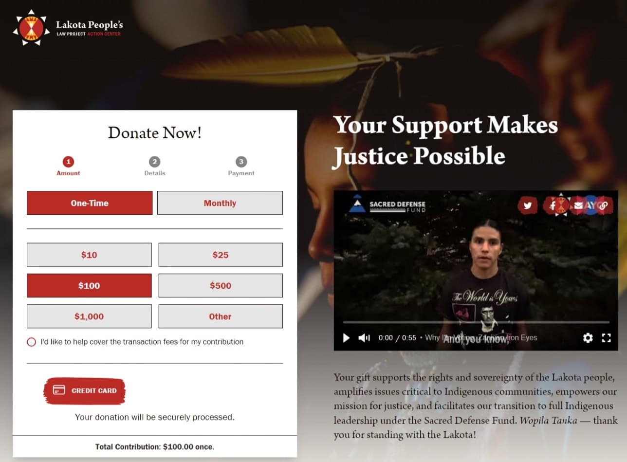
The Lakota People’s Law Project shows an even simpler donation form and highlights some other great donation page techniques.
This organization’s donation form is collapsed until the donor starts filling it out, showing that it will just take three easy steps. This makes it appear even simpler than most forms. It also puts the option to make it a recurring donation at the top and mentions the option to cover fees in step one.
Finally, the Lakota People’s Law Project has chosen to use a combination of a compelling video and a short paragraph of copy to convince potential donors to follow through. This material highlights the fact that supporting the Lakota People’s Law Project can help amplify issues that affect all Indigenous communities, not just those facing the Lakota people.
Finally, this video and donation page copy thank the donor for their contribution.

Chicago Cat Rescue donation page screenshot
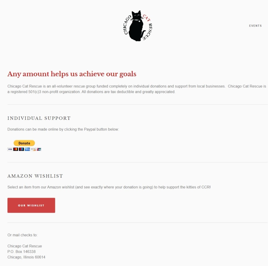
The Chicago Cat Rescue is a small but mighty organization. Its donation page is simple but effective.
First, the Chicago Cat Rescue’s donation page points out that they are supported only by private donations and local businesses. The copy also reminds donors that all donations are tax deductible.
Finally, this donation page offers multiple ways to donate: PayPal, via mailed check, and with a link to an Amazon wishlist.
Though not the most complex donation page, the Chicago Cat Rescue’s is still effective.
Creating an inspiring donation page is essential for nonprofit success. By incorporating key elements such as user-friendly design, compelling storytelling, and trust signals, nonprofits can significantly increase donations.
As you refine your donation page, remember to maintain a clear and authentic message. Ensure your content aligns with your mission and engages donors emotionally. Continuous testing and optimization based on data-driven insights will keep your page effective.
Take inspiration from successful donation page examples, and consider how these strategies can apply to your organization. With a thoughtful approach, your nonprofit can enhance donor engagement and grow its impact. Always be open to new ideas and innovations as digital trends evolve.
DOWNLOAD The Auction Profit Blueprint
The 4 tools BIG organizations use every time to skyrocket auction profits!
The Step-By-Step Guide to stop leaving thousands on the table.

